What To Expect When You’re Websiting: Part 3- GESTATION: THE FORWARD TRIAD- (i) Website Design- For Looks
Continuing with your website’s development being akin to a living thing with stages (and we’ll see how far we can go with that!) I finished at the ‘CONCEPTION’ stage in Part 2 where it actually got graphic, without offending anyone by the way, and the website wireframe was conceived.
Technically, gestation is the phase of development from conception ending with birth. In our analogy the ‘gestation’ phase is where the site is developed beyond the wireframe, putting some substance to that outline or skeleton so to speak and will end with the actual finished website being born.
Again we have to be systematic as to achieve this requires input from you, the site owner, and myself as the designer and it would pay not to be linear in approach as many things can be accomplished at once.
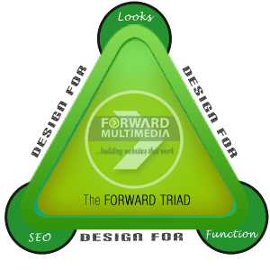
On the Forward Multimedia ‘Website Design’ page, I described my process I call THE FORWARD TRIAD: a trio of concepts I use as guidelines for every website I build.
THE FORWARD TRIAD
 Website Design for Looks
Website Design for Functionality
Website Design for SEO
WEBSITE DESIGN FOR LOOKS
I’m yet to hear someone say “I’ve never met a website I didn’t like”. The Trinidad online landscape is replete with butt-ugly websites that no visitors head for the hills the instant they see them. Never mind what they say about inner beauty, if a website is not attractive at the first glance, it’s not going to get more attractive at the second.
Definition of looks
‘Looks’ refer to the visual design and can also be expanded to include ‘look and feel’. The ‘feel’ part overlaps a little into the FUNCTIONALITY aspect so I’ll touch on it now and later. In Trinidad, the most landed on page would be the Homepage so it makes sense to focus a lot of effort into getting it right.
Visual Design
By this I mean the pure visuals: overall look, layout, colors, typography, imagery- all working in concert to make a knockout first impression and entices the visitor to stay and delve deeper. Trinidad websites are notorious for being eyesores and un-inviting and Trini’s are fed up.
Its starts with the template
If you’re hung up about using templates and prefer a uniquely designed website from scratch then start saving at least $2,000 US Dollars and good luck with that. I use templates designed for Content Management Systems which are dynamic and more SEO friendly than static sites. Templates are not to be used exactly the way they are by simply switching demo content with your own. Templates are the starting point, not the finishing, a good web designer will creatively analyze your business and select the appropriate elements accordingly.
Picking the template
Selecting the right template (also known as theme) is an art, even a science by itself as its objective and subjective at the same time. I’ve looked at many Trinidad websites that use themes not really suited for their business. One can’t simply apply a set of rules as it still boils down to listening to my inner voice to make the final decision. Still I have a process, taking into account:
From the business side
- The industry in general
- The nature of the business
- Branding & positioning
- The goals of the website
- The specific selling points that need to be featured
- Similar local and foreign websites
Then look to the template side
- Its design and aesthetics itself
- General Homepage layout(s)
- Special features- e.g. layer sliders, unique widgets, image scrollers, pricing grids, portfolios
- Reliability/support of the author
- Built-in customization options
Looks are everything as you need to capture your visitor’s attention. Once you have their attention, that’s one foot in your doorway. Now you need to draw them one step further to push the door wide and completely step in and that’s where the next point of the triad comes in. See you then.


Comments (1)